What goes into designing a top-tier rugby shirt and how does the process work? We delve into how we clad the athletes on rugby’s own muddy runway…
How do you represent the people of an entire ocean region? That was the challenge facing the Moana Pasifika franchise when they began plotting their first season in Super Rugby. Based in Auckland but held up as a symbol for all of Pasifika and their diaspora of kin, what they wore out on the field had to speak to, and for, a vast array of people.
According to Moana chief executive Pelenato Sakalia, step one was deciding on a logo that represented the Pacific as well as symbols that bind peoples together. With the help of designer Phila Lagaluga, they settled on their badge. But then it was all about the jerseys.
“We assembled a number of people so that we had different perspectives,” Sakalia says. “Phila was a part of this. We had people like Sir Michael Jones. We had some young Pasifika students. Kevin Senio, our rugby director, myself and our apparel partner, Dynasty. They had their designer on board, who just so happens to be of Pasifika decent.
“Colours were really important. Pasifika is really vibrant, Pasifika love colours. And the central theme was the Moana – the ocean. So we had to find a colour symbolic of the ocean.
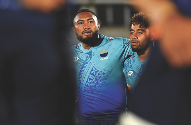
“And the second thing that really came through was our motifs. For those with a good eye, all the Pacific nations, big or small, all the motifs are represented on the jersey. Samoa, Tonga… even the small island groups. I’m from Tokolau, by far the smallest island group, and our motifs are on the jersey. To the layman it looks like different patterns but for those who come from the cultural background, they can spot the nations.”

Moana Pasifika’s alternate jersey (Getty Images)
It’s quite the juggling act. Sakalia goes into detail talking about how the design over the heart of the shirt represents women in the family and how the away shirt had to marry the colours of both Samoa and Tonga in one garment.
Coming up with a design for your new brand is difficult anyway, but as Sakalia adds: “The thing about the Pacific is if you get it wrong you’ll never live it down!” So rushing anything through was never an option. But hoo-boy, have we seen some rugby teams get it wrong when it comes to kit design.
Related: Are these the worst rugby shirts of all time?
History is littered with the ill-conceived jumpers of famous sides who flew too close to the disco ball. Gaudy, busy and brighter than any shirt needs to be, we can all recall the worst we’ve ever seen. Get it right, though, and a shirt lives forever.
How rugby shirts are designed
Yet to understand why most of the shirts we see today are the way they are, you might need an insider’s eye. Scott Smith is senior product manager at Gymshark but has worked in rugby for ASICS, Canterbury, Nike and Under Armour, helping to put together shirts for sides like the Springboks. He could talk to you all day about body-scanning elite athletes for optimal fit, or the mountaineering yarn used in kits. But with his experiences, he can also break down for us what’s changed lately in the manufacturing landscape.
“In the mid-2000s, rugby was an innovation platform because of the demands of the sport,” he tells us. “Remember, a rugby shirt has to function like a running singlet in terms of wicking sweat and temperature control but then it also has to perform like a wrestling singlet in terms of toughness. So getting the balance right was tough in the beginning, in those early days.

South Africa and Canada swap jerseys (Getty Images)
“But rugby doesn’t have the same following as basketball in the US or soccer globally. Rugby jerseys, roughly at that time, were costing about $16 a jersey to produce – which might not sound like an awful lot of money but when you put it next to a football jersey, which was costing about $3 or $3.50, the profitability on football jerseys was much better. So a lot of brands after the financial crisis started to go the way of treating rugby like a ‘team sport’.”
With bigger brands doing fewer bespoke designs to promo the big sides, they could use the ‘team sport’ approach of getting the same ‘chassis’ or ‘silhouette’ of kit for each account, and just changing the colour of fabric, prints and slapping logos on it. Sure, big teams roaring towards flagship events will demand special treatment but as we got into the land of team sports accounts, the competition has intensified and brands like Macron have really made it work.
Related: Latest kit deals
Of course, rugby kit manufacturers don’t – and should never – exist just to service the elite game. And sometimes the symbiosis between the two sides can work well. Just ask Canterbury. They are looking to move things forward now, and while in the elite game they only provide kit for Ireland exclusively, as well as the British & Irish Lions, there is the amateur side.
“We also have around 800 grass-roots clubs that wear Canterbury teamwear,” explains senior brand manager Ben Cooper. “There’s a bit of cross innovation between the two. So sometimes we’ll test innovation through our teamwear product, test innovation through our elite product, and then we can find the common ground.”
The beauty of being a kit provider is that you can readily change the colour of the fabric and no one would click. So a lot of what you see Ireland wearing was actually tested out first by West Bridgford RFC, who have just gained promotion from Midlands One East. They have become part of the story of Andy Farrell’s side, and Canterbury are on the lookout for other clubs to help out.
But back on their designing for elite sides like Ireland, Cooper says of styles: “Essentially it’s insight driven. Which if we had 50 elite-level teams, we probably can’t put the amount of time in.

Women’s kit needs brand focus (Inpho)
“So that falls off the back of our design codes, values and style guides and the like. We look at the feedback from the team and coaches, as well as fans and consumers because everything obviously ladders down. We build out that data insight. We then move into the new technologies and fabrics that correlate to what we know people want, what players want, as well as what’s available without going too deep.
“I think lots of people can make a jersey that costs $1,000 to make, but actually having one that has got the right credentials from an environmental point of view as well as a cost point of view is the tricky part. And then it’s all about testing and player feedback, consumer feedback and making sure that it’s not just a linear journey – it’s very much a constant loop.”
Canterbury can’t go into detail but they are trialing and developing for Ireland’s 2023 World Cup push. That means rigorous testing (which is where amateurs come in, as pros’ contact time is capped). In many ways there is a doubling-up of the process too, as the women’s team have differing physiological demands and must be a big part of any ‘feedback loop’ that Canterbury pride themselves on. The aim is functional on-field products that all players love.
But what about those brands who have several elite assets? Adidas currently cater for Munster, Leinster, Harlequins, Brive, La Rochelle, Perpignan, Blues, Crusaders, Chiefs, Hurricanes, Highlanders, Suntory, Toyota Verblitz, Ricoh Black Rams, Kobe Steelers, Docomo Hurricanes and all of the New Zealand international sides (and breathe).
According to Matthew Fielding, their category director for field and podium sports: “For most teams we offer a bespoke product collection across match wear and training wear. We provide a bespoke product creation process for all our partners dependent on the needs for the season. We operate on a seasonal basis to capture the needs of the rugby calendar. For example, Rugby World Cup Sevens and Rugby World Cup 2021 both happen this year, so the needs of those teams are elevated for specific competitions.”

Crusaders and Blues face off. (Getty Images)
All their club sides have the same base silhouettes to ensure there is no competitive advantage between them. Print patterns and colours is what sets them apart. Fielding adds: “We have quite a lengthy product creation calendar that starts with a ‘dream phase’ to workshop ideas and themes for the season.”
In recent years, you’d have bet on players opting for classic, plain, simpler styles. But a glance at the Crusaders, Chiefs and, of course, Moana Pasifika shirts this year tell you that flair, decals and big symbols are all the rage again.
Pushing the Black Ferns is a big focus for adidas this year, while they intend to launch their new sevens looks in July. Fielding says: “It’s been a tough couple of years to innovate, test and improve given lockdowns and the inability to travel to work closely with the teams. And the lack of international rugby has presented everyone with problems.”
He jokes about how often people say “It’s just another black jersey!” when All Blacks kit lands. They see innovation as advancing tech for bodymapping, fit and durability. They’ll look at the collar, shape and sleeves but he implies that the team keep pulling black rabbits out of hats.
Adidas claim to lead on reducing impact on the environment. It’s a big topic too at Canterbury. And with their tradition of an ‘uglies’ range with cast-off fabrics sewn together, maybe it’s time to unveil Uglies 2.0.
This feature first appeared in Rugby World’s ‘Style Issue’, on sale throughout May.
Download the digital edition of Rugby World straight to your tablet or subscribe to the print edition to get the magazine delivered to your door.
Follow Rugby World on Facebook, Instagram and Twitter.


