Every home shirt from the new French top-flight season ranked and reviewed
In this guide to Top 14 2025/26 rugby kits ranked, we cast an eye over every home shirt taking the field this year.
Even if your team’s playing squad and coaching staff have had a major overhaul over the summer, one of the most exciting moments in any close season is the unveiling of your team’s new kit. Modern rugby shirts tend to be as varied and inventive as their football counterparts, and this year’s selection of Top 14 rugby kits is no exception.
Les maillots domiciles for the 2025/26 season range from timeless classics to jerseys you may think twice about wearing in public. Read on to find out who tops the fashion league in our guide to Top 14 2025-26 rugby kits ranked.
Top 14 rugby kits 2025-26: Ranked and rated
14. Pau
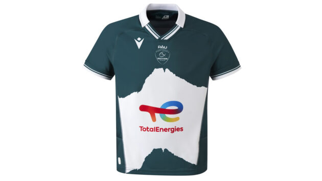
Last season’s comparatively simple bottle green affair gets a very messy update. Is that white area across the front a badly drawn representation of Australia, or the result of someone ripping the shirt in an Incredible Hulk-style rage? It’s hard to tell what Macron were thinking with this one.
Editor’s verdict: An otherwise good-looking design ruined by that scrappy block of white around the sponsor’s logo.
13. Castres
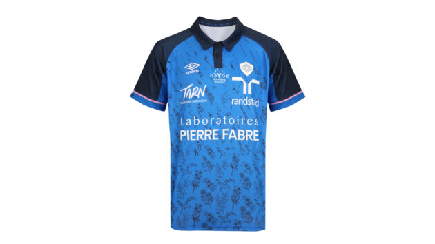
Oh to have been a fly on the wall when British manufacturer Umbro came up with this design. Squint and this looks like a neat mid-blue design, with classy navy sleeves. Zoom in, however, and that elaborate wildflower motif has echoes of the curtains in your gran’s spare room.
Editor’s verdict: One of the most unconventional and overly ornate fabric designs in recent memory.
12. Bayonne
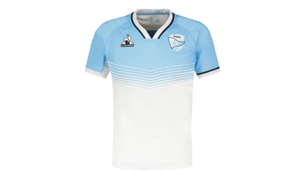
Sky blue and white are usually perfect bedfellows (see Racing 92, Argentina, Coventry City), but any interest in this shirt evaporates below the chest area. It’s like it’s being worn by the invisible man, cursed to dissipate into nothingness from the torso down. Strong shoulders, though.
Editor’s verdict: The top third is decent enough, but where’s the rest of it?
11. Montauban
(VALENTINE CHAPUIS/AFP via Getty Images)
Top 14 newbies Montauban won’t top the style league with their new shirt. The Joma design sticks with the club’s traditional dark green colour scheme, but those paler pinstripes add little to the ensemble. Something a little bolder could have made more of a statement, though the flashes of yellow on the flanks feel unnecessary.
Editor’s verdict: We’re not sure the pinstripes add much to Montauban’s look.
10. Clermont Auvergne
This Macron strip is undeniably a retrograde step from last season’s blue-sleeved design, as the blue piping around the front of the shirt is too apologetic to enhance an otherwise non-descript yellow design. The ECG-style motif in the fabric, meanwhile, is just weird – is this a heavy-handed metaphor for the club being the heartbeat of the town?
Editor’s verdict: Takes bland inoffensiveness to the extreme.
9. Stade Français
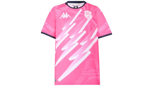
Nobody could accuse Kappa of being samey this year. In fact, the contrast with the elegant Bordeaux Bègles jersey couldn’t be starker, as this design mixes garish pink with Eiffel Tower motifs and a very prominent representation of the three lightning bolts from the club logo. Impossible to ignore – though not necessarily for the right reasons.
Editor’s verdict: You can’t fault its boldness, but this shirt is more miss than hit.
8. Toulon
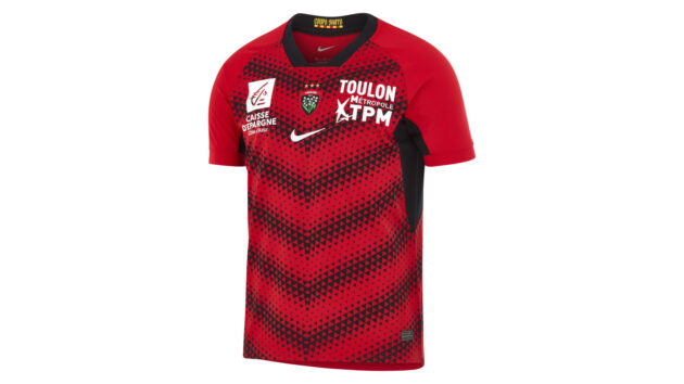
Like Toulouse (see below), Toulon have opted for a 21st century spin on red and black hoops this season. The club’s latest Top 14 rugby kit is rather less successful than their rival’s, however, its triangle-based design so intricate that it’s liable to give fans and opposition players alike a headache. Who knows, maybe it’s all part of a sly plan to distract the officials.
Editor’s verdict: At least it’s an improvement on last season’s effort.
7. Montpellier
When it comes to iconic sleeve branding, Hummel’s chevrons are second only to Adidas’s famous stripes. The Danish manufacturers have nearly made something brilliant here – if only they’d been able to make a choice between fading out the stripes at the bottom or lightening them on the right. Do one, not both.
Editor’s verdict: There’s lots to like here but Hummel have tried a little too hard to shake things up.
Read more: All the latest rugby fixtures and how to watch wherever you are in the world
6. Lyon
Lyon stick with their usual colour scheme, but Macron have played around with the positioning and proportions of the red. This design is actually more grey than black, and – thanks to a surprisingly effective, borderline optical illusion pattern in the fabric – it almost looks like it’s shimmering.
Editor’s verdict: This Top 14 rugby shirt could have easily felt fussy but somehow it works.
5. Racing 92
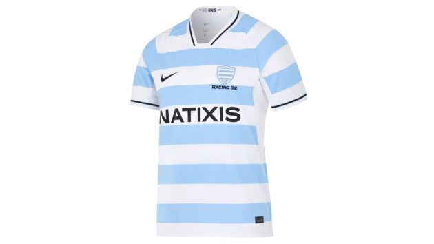
Whether it’s the rugby team’s horizontal stripes or the football side’s vertical look, Argentina’s sky blue-and-white colour scheme is utterly iconic. As a result, Racing 92 can’t go wrong with this unfussy design – it’s almost like Parisians know a thing or two about fashion.
Editor’s verdict: It’s almost impossible to mess up this Pumas-adjacent look.
4. Toulouse
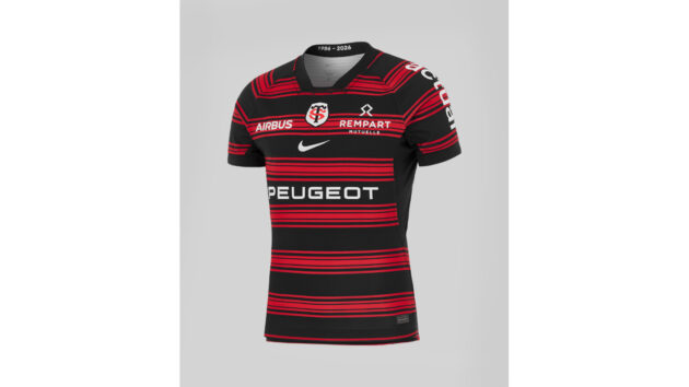
After last season’s messy, predominantly black affair, the reigning Top 14 champions get back to basics with this modern spin on classic hoop designs. It still emphasises le noir, but those thin red stripes really are the business. The central badge and Nike swoosh also make for a pleasingly symmetrical shirt.
Editor’s verdict: Simultaneously traditional and modern, it’s a jersey fit for the most successful side in Top 14 history.
3. La Rochelle
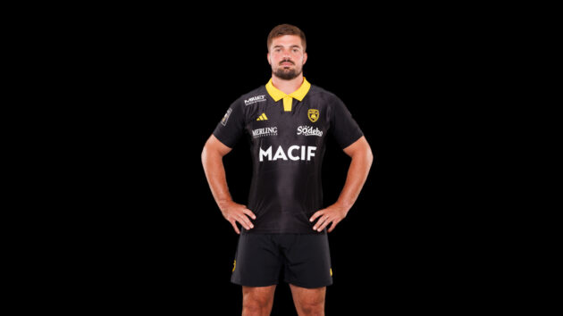
After a very long association with New Zealand, Adidas know a thing or two about making all-black kits. They’ve made the most of that experience with this elegant and simple design. The bold statement yellow of the collar is the perfect complement to this Top 14 rugby kit’s shiny black design.
Editor’s verdict: It’s like Wasps never went away.
2. Perpignan
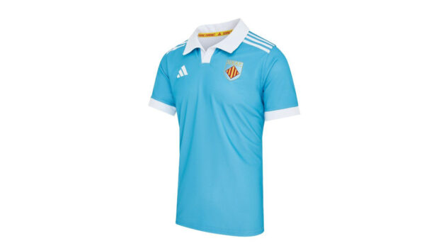
The Occitanie side only just maintained their Top 14 status last season, and they’ve celebrated their survival with an absolute banger of a kit. This design has the effortless minimalism of a vintage football shirt design from the ’70s, with the Adidas stripes and logo only serving to enhance the classy Lazio vibe.
Editor’s verdict: A shirt design so timeless you could wear it with pretty much anything.
1. Bordeaux Bègles
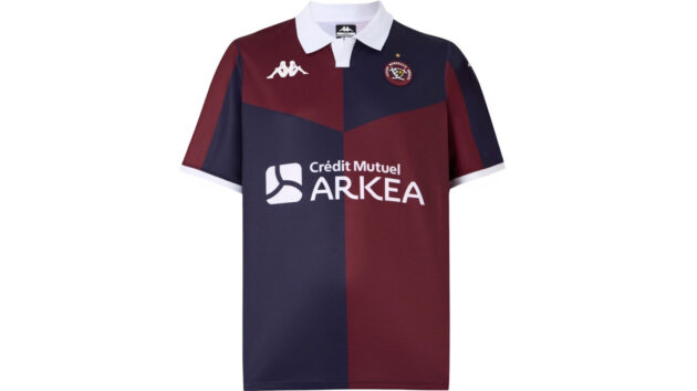
The European champions head into the 2025/26 season wearing a Top 14 rugby shirt worthy of topping any table. Indeed, Damian Penaud and Louis Bielle-Biarrey are going to look the business terrorising defences in a Kappa jersey that runs new angles on Harlequins quarters and classic Blackburn Rovers away kits.
Editor’s verdict: The addition of the dark blue quarters, and the white collar really enhances last season’s plainer claret design.
Download the digital edition of Rugby World straight to your tablet or subscribe to the print edition to get the magazine delivered to your door.